Layout: Sections and Instructions
The Sections and Instruction components are found in the Form Builder side panel under Layout. Layout is the first section of the side panel in all form types except the form used to configure an Object Class Card View.
Section
All components must be placed within a section. When a new form is created, the Form Builder automatically adds a section by default.
Adding sections allows you to organise a form into subject areas or divide large forms into smaller, more manageable parts.
Click a section header to configure it. The side panel then displays Section Properties and Conditional Visibility options.
In Card View, Section Properties are available, but Conditional Visibility is not because Card View supports only a single section.
Section Properties
The example below shows the Section Properties panel from a Task Template.
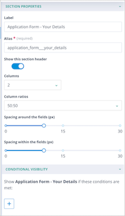
Label – The text displayed in the section header. By default, this is set to New Section 1 but can be changed as required.
Alias – Automatically generated from the Label. This can be edited until the form is saved.
Show this section header – Controls whether the section header is displayed. Fields and instructions within the section remain visible unless Conditional Visibility is used.
Columns – Allows the section to be divided into columns. Available options depend on the area being configured:
- Card View – 2 or 3 columns
- Create and Edit View – 1, 2, or 3 columns
- Summary View – 1 or 2 columns
- Standalone Forms – 1, 2, or 3 columns
- Task Templates – 1, 2, or 3 columns
Column ratios – Available ratios depend on the number of columns selected. For example, two columns can use ratios such as 50:50 or 25:75.
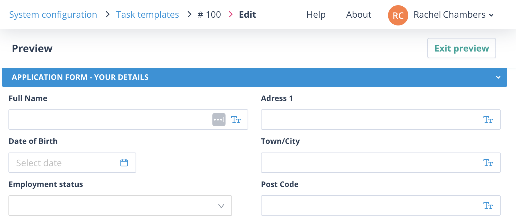
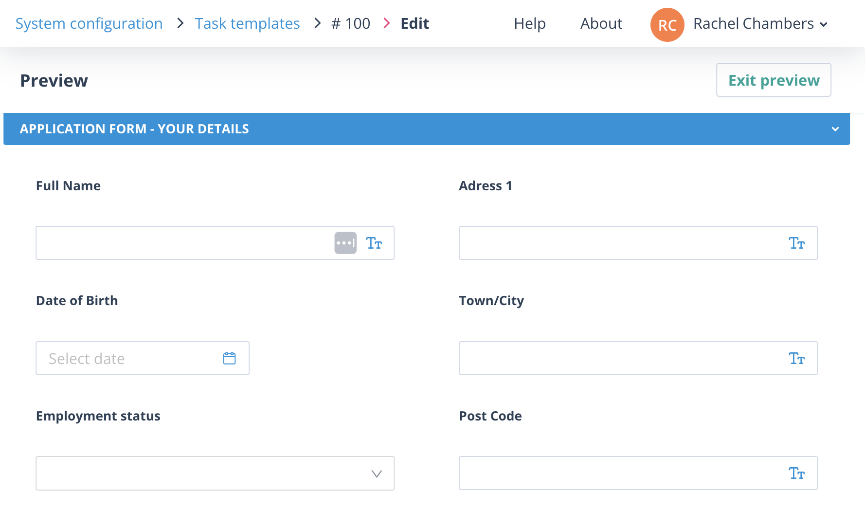
Spacing around the fields (px) – Controls the space around components. The default value is 10 pixels and can be increased up to 30.
Spacing within the fields (px) – Controls the space between components. The default value is 10 pixels and can be increased up to 30.
| Default spacing around and within fields | Spacing around and within fields increased to 30 pixels |
|---|---|
 |  |
Conditional Visibility
Conditional Visibility allows you to change the behaviour of a form by showing or hiding sections based on values entered or selected by the user.
This functionality uses Conditional Logic.
For more information, see the article on Conditional Logic in forms.
Managing Sections
Moving sections
Sections can be moved by dragging them up or down the canvas.
It is often easier to collapse a section before moving it. The collapse/expand icon appears immediately to the left of the section label.
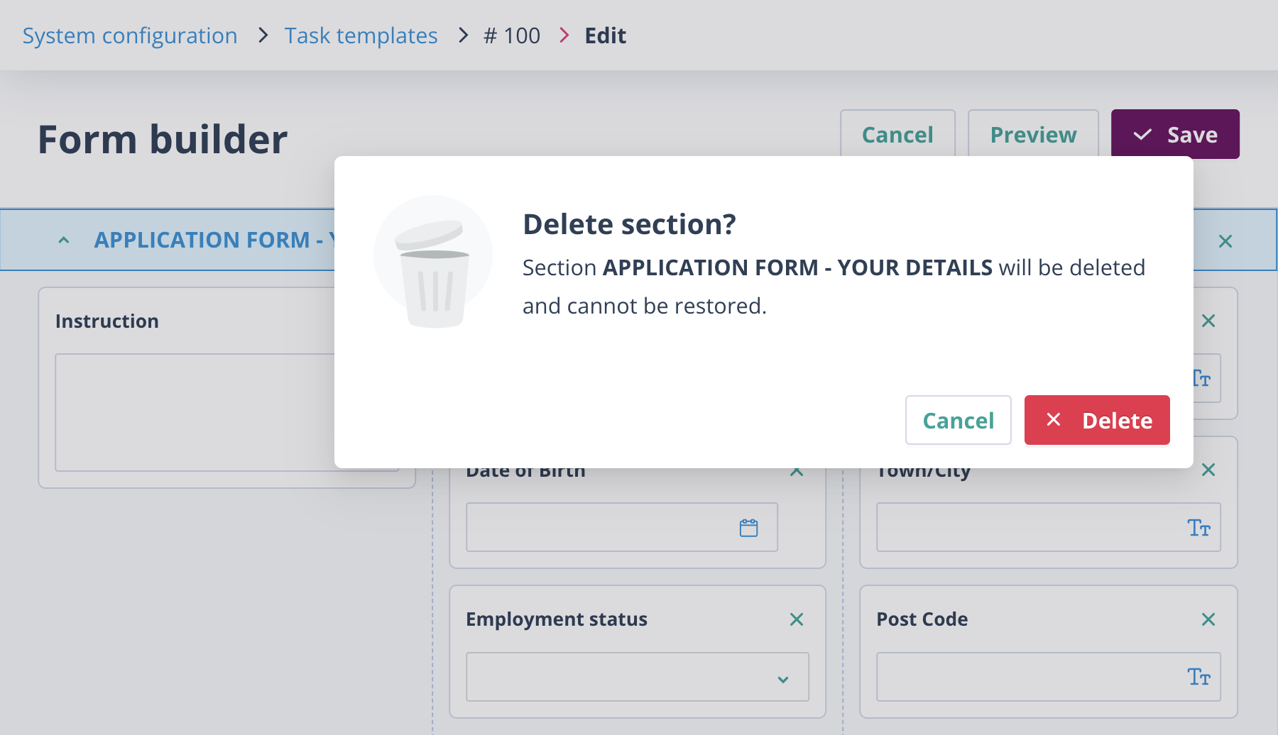
Removing sections
Sections can be removed from the canvas by clicking the X in the top-right corner of the section header.
You will only be asked to confirm the action if the section contains other components, such as instructions or fields.
A form must always contain at least one section, so it is not possible to remove all sections from a form.
Removing columns from sections
Columns can be removed by reducing the number of columns configured for the section.
If any column contains components, a confirmation dialog appears asking which column should be removed.
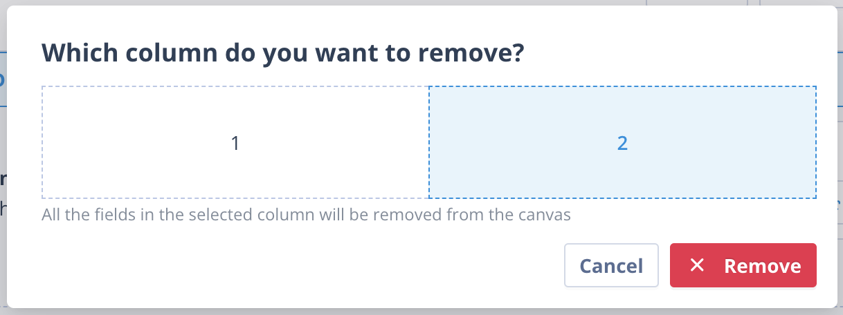
Select the appropriate column. The selected column is highlighted in blue and the Remove button becomes available.
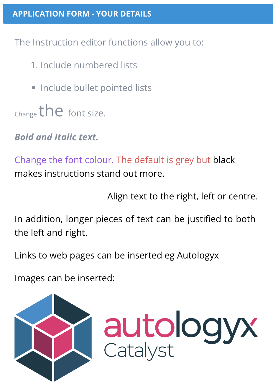
Instruction Component
The Instruction component can be placed anywhere within a section.
It is useful for:
- providing guidance on completing a form
- displaying reminders or important information
- explaining data requirements
- providing examples of data structures or syntax
Drag and drop the Instruction component into the required position on the form.
Click the component to open the Instruction Properties panel.
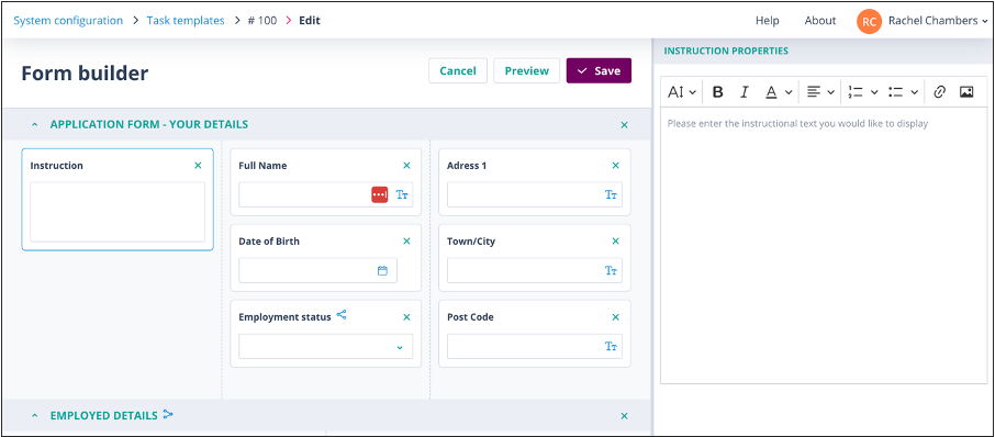
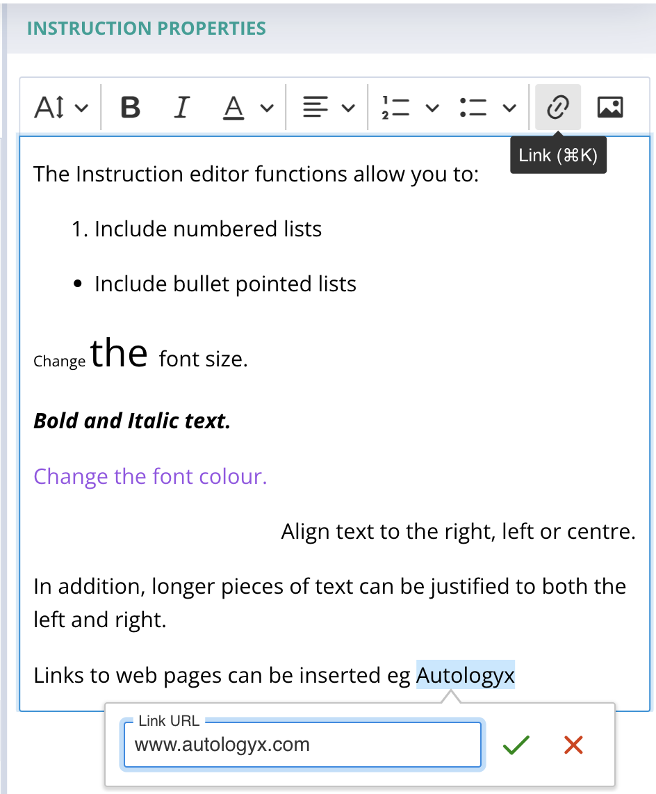
The Instruction Properties panel contains formatting controls and a multi-line text editor.
| Configuring the component | How it appears in Preview and on the form |
|---|---|
 |  |
After previewing the form, simply click the Instruction component again to make further changes.
An Instruction component can be removed by clicking the X in the top-right corner. No confirmation is required and the component is removed immediately.
Things to remember
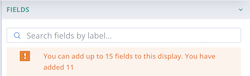
- There is no limit to the number of components that can be added to a section, except in an Object Class Card View, which is limited to 15 fields.
- A form must always contain at least one section.
- Conditional Visibility can be used to show or hide sections based on user input.
- Instruction components are useful for guidance, examples, and contextual information.
- Column layouts and spacing settings can be adjusted at any time.
As you approach the Card View field limit, the following warning is displayed: