List pages
List pages are used throughout Catalyst to display and manage records, tasks, configuration items, and other system objects.
This article explains the common controls and features available on most list pages.
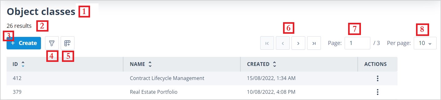
- List name
- Number of records in the list
- Button used to create a new record
- Filter editor
- Column configuration
- Page navigation
- Current page
- Number of results per page
To provide more detail about these controls, starting at the top left-hand side of the page, most list pages contain the following items:
List name
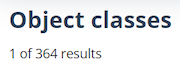
Results - shows either the total number of items in the list or, when a filter is applied, the number of matching results out of the total.
+ Create - opens the form required to create a new item.


Page controls
Moving horizontally across the page to the right are the page controls. These allow you to set the number of rows displayed per page: 10, 25, 50, 100, or All. Selecting All enables infinite scrolling.
If you change this setting, paging is reset to the first page.
You can configure different numbers of rows per page for each list page, and these settings are retained for future visits.
You can move between pages using the First page, Previous page, Next page, and Last page controls. These controls are disabled when they are not applicable. For example, Last page is disabled when you are already viewing the final page.

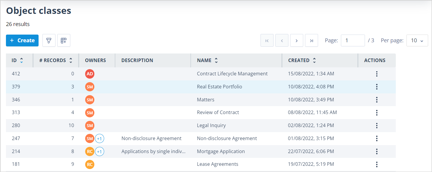
Main content area
The main content area of the page is made up of column headers and list items.
All list pages contain the following columns:
- ID - a number automatically assigned to each new item or object when it is created. ID numbers are unique within the context of a list.
- Name - user-defined text.
- Created - a date and time stamp automatically applied when an item or object is created.
- Last Edited - a date and time stamp automatically applied when an item or object is modified. On the Users list, this column is replaced by Last Logged In.
- Actions - a kebab menu containing actions that vary depending on the list page and the user's role permissions.
The ID column can be repositioned but appears furthest left by default. The Actions column always appears furthest right.
List pages also contain additional columns depending on the type of information being displayed.
| List page | Other column headers | Description | Object Classes | Created By | Last Edited By |
|---|---|---|---|---|---|
| Records | X | X | Yes | X | X |
| Tasks | Completed Completed By Record Task Type Template Status Due Date | X | X | X | X |
| Object classes | # Records Owners | Yes | X | Yes | Yes |
| Task templates | # Tasks Created Last Task Created Task Type Task Creation Mechanism | Yes | X | Yes | X |
| Task group templates | # Of Task Templates | Yes | Yes | X | X |
| Sequences | State API Actor Names # Of API Actors Task Group Templates | Yes | Yes | X | X |
| Users | Username Roles Account Type Last Logged In | X | X | X | X |
| Roles | X | Yes | X | Yes | Yes |
| User Groups | # Members # Owners | Yes | X | Yes | Yes |
| Single sign-on settings | Provider Enabled Auto User Creation | X | X | Yes | Yes |
| Authentication objects | Provider Usage | Yes | X | Yes | Yes |
Selecting and opening items
Clicking a row in the list selects that item. If the side panel is open, the details shown update to reflect the current selection.
Double-clicking a row opens the item in Edit mode, provided the user has permission to edit it.
A selected row is highlighted, while other rows retain the standard alternating row colours.
Sorting and resizing columns
Some column headers allow the list to be sorted alphabetically, numerically, ascending, or descending. Where available, click the column header to change the sort order.
When sorting is changed, paging is reset to the first page.
Sorting preferences are retained for future visits.
The width of visible columns can be increased or reduced by dragging the right edge of the column header.
Scrolling
All list pages support both vertical and horizontal scrolling when more rows or columns are available than can be displayed on screen.
Column headers and page controls remain visible while scrolling vertically, making it easier to navigate large lists.